1. Let's get started
- Start your text editor. For this tutorial we will be using Atom.
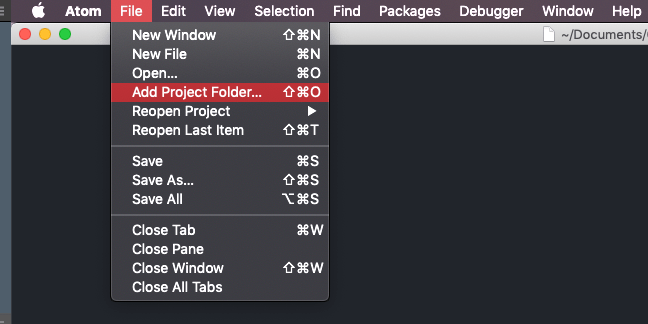
- Click on File in Atom's menu and then Add Project Folder....
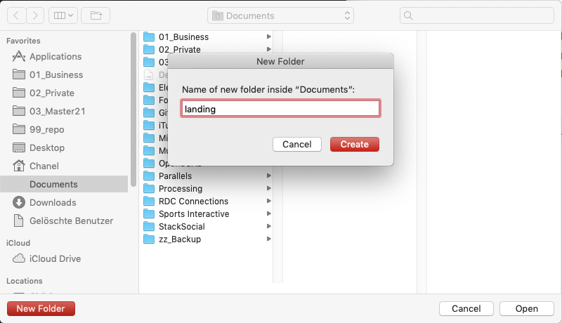
- Create a new folder and name it
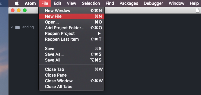
landingon your Desktop. Click in Atom on File > Open... once you've created the folder. - In Atom we'll now add a New File.
- Save the file as
index.htmlin the folder we created beforehand (landing). - Work through steps 4. and 5. again to create a further file and name it
style.css. - Lastly we'll create a new folder within our landing folder. In Atom right-click on our landing folder and choose New Folder.
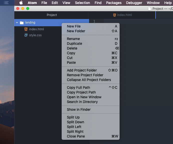
- Name the new folder
images.
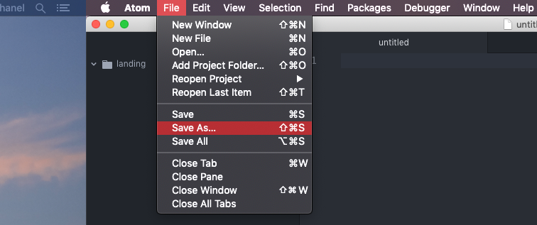
The goal is to have a index.html and style.css as files in our landing folder as well as an images folder.
The folder and the files are visible in our text editor.

2. Add HTML content
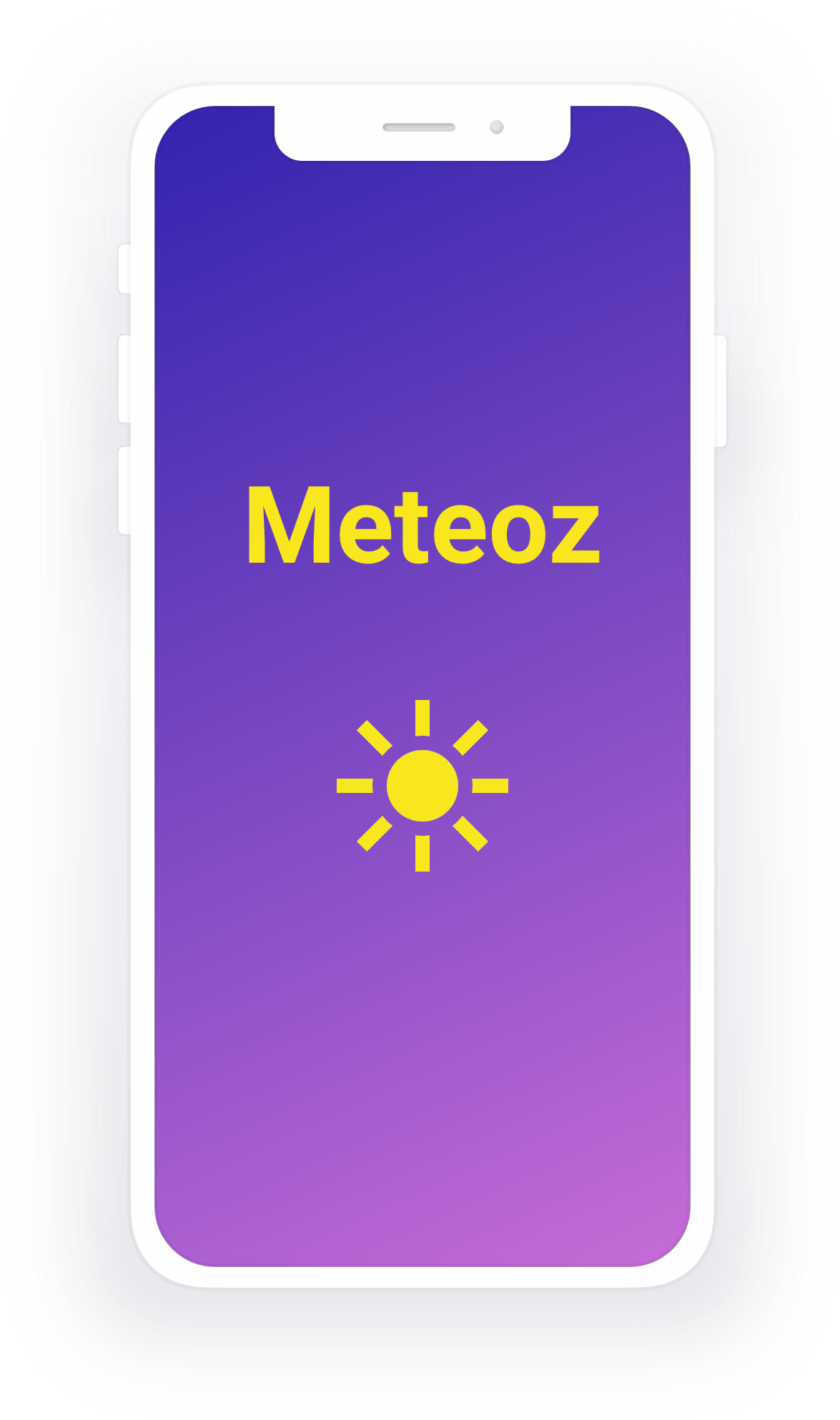
- Go ahead and save the following images by right-clicking on it. Save them to your
imagesfolder and name themiPhone.pngandhero.jpg.

index.html file
  <!DOCTYPE html>
  <html>
    <head>
      <meta charset="utf-8">
      <title>Meteoz</title>
    </head>
    <body>
      <header>
        <h1>The ultimate weather forecast app</h1>
      </header>

      <main>
        <h2>We can't make the weather...</h2>
        <p>but we can make sure, that you know exactly, what the weather is going to be like.</p>

        <a href="#">Buy it!</a>

        <img src="images/iPhone.png" alt="Mockup of Meteoz app">

        <p>
          The best apps are made by passionate users. We lost count of how many terrible weather forecast apps we've used.
        One day we decided to make the best weather forecast app ever: Meteoz!
      </p>
        <p>
          We are convinced that each and every user will share our perception:
        Never has checking the weather been easier and lovlier.
      </p>
      <p>
        Meteoz is the only weather forecast app you'll ever want to use again.
      </p>

      </main>

      <footer>
        <p>Meteoz Ltd.
        <br>
        Infinite Loop Str. 2
        <br>
        11001 Silicon Valley
        </p>
      </footer>
    </body>
  </html>
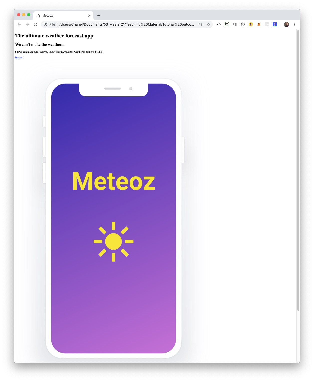
- In Finder double-click on your
index.htmlto see the outcome of so far in your preferred internet browser.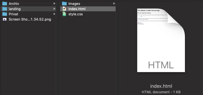
The goal of this step: We now see the HTML we added in our browser.
3. CSS for fonts & colors
- Link your stylesheet
style.cssin theheadsection of yourindex.htmlfile.
 <!DOCTYPE html>
  <html>
    <head>
      <meta charset="utf-8">
      <title>Meteoz</title>
      <link rel="stylesheet" href="style.css">
    </head>
  ...
- Then copy/paste the CSS code below into
style.css.
  body {
  background-image: linear-gradient(to bottom right, #3023AE, #BC67D4);
  font-family: 'Roboto', sans-serif;
  font-size: 20px;
  margin: 0;
  }

  header {
    background-image: url('images/hero.jpg');
    background-position: center;
    background-size: cover;
    height: 600px;
  }

  h1 {
    background-image: linear-gradient(to bottom, rgba(128, 128, 128, 0.1), rgba(128, 128, 128, 0.4));
    color: #F8E71C;
    font-size: 65px;
    margin-top: 0;
    position: relative;
    top: 45%;
    left: 5%;
    width: fit-content;
  }

  img {
    height: 500px;
    width: auto;
  }

  footer {
    background-color: #F8E71C;
    height: 200px;
    text-align: center;
    padding-top: 65px;
  }
- Since we chose Robot as our main font (see the styling for the
bodyelement in ourstyle.cssfile), we also have to link that font to yourindex.htmlfile.style.css.
 <!DOCTYPE html>
  <html>
    <head>
      <meta charset="utf-8">
      <title>Meteoz</title>
      <link rel="stylesheet" href="style.css">
      <link href="https://fonts.googleapis.com/css?family=Roboto:400,400i,700" rel="stylesheet">
    </head>
  ...
Extra
- You want to use a different font? Visit Google Fonts and try to add it on your own.
- Would you prefer another background color? You can find nice colors on Color Hunt and add them to your
style.css.
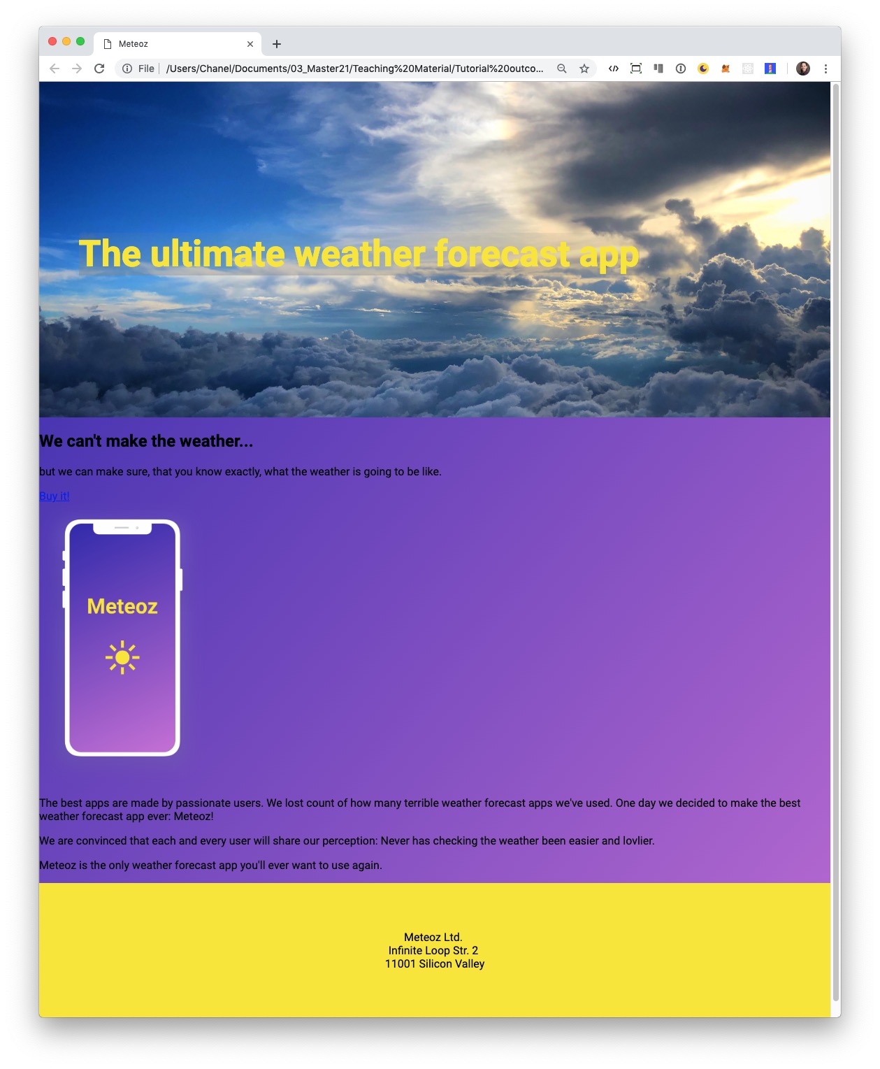
Our website should look something like the following at this point:
4. Wrap it inside DIV
Wrap the different sections within our main area into div so that we are ready to finetune our HTML's layout in the following steps.
  ...
  <main>
    <div>
      <h2>We can't make the weather...</h2>
      <p>but we can make sure, that you know exactly, what the weather is going to be like.</p>
    </div>

    <a href="#">Buy it!</a>

    <div>
      <img src="images/iPhone.png" alt="Mockup of Meteoz app">
    </div>

    <div>
      <p>
        The best apps are made by passionate users. We lost count of how many terrible weather forecast apps we've used.
        One day we decided to make the best weather forecast app ever: Meteoz!
      </p>

      <p>
        We are convinced that each and every user will share our perception:
        Never has checking the weather been easier and lovlier.
      </p>

      <p>
        Meteoz is the only weather forecast app you'll ever want to use again.
      </p>
    </div>

  </main>

  ...
Extra
Refresh your web browser. Think about it: how come we added a half a dozen of HTML tags, but we see no difference in the appearence of our website?
5. Name your tag
- To reference the section with our tagline, we add
class="tagline-container"to the correspondingdiv.
  ...
  <main>
    <div class="tagline-container">
      <h2>We can't make the weather...</h2>
      <p>but we can make sure, that you know exactly, what the weather is going to be like.</p>
    </div>
  ...
- Then add this CSS code to the bottom of your
style.cssfile.
  ...
  .tagline-container {
  padding: 150px 0;
  text-align: center;
  color: white;
  }
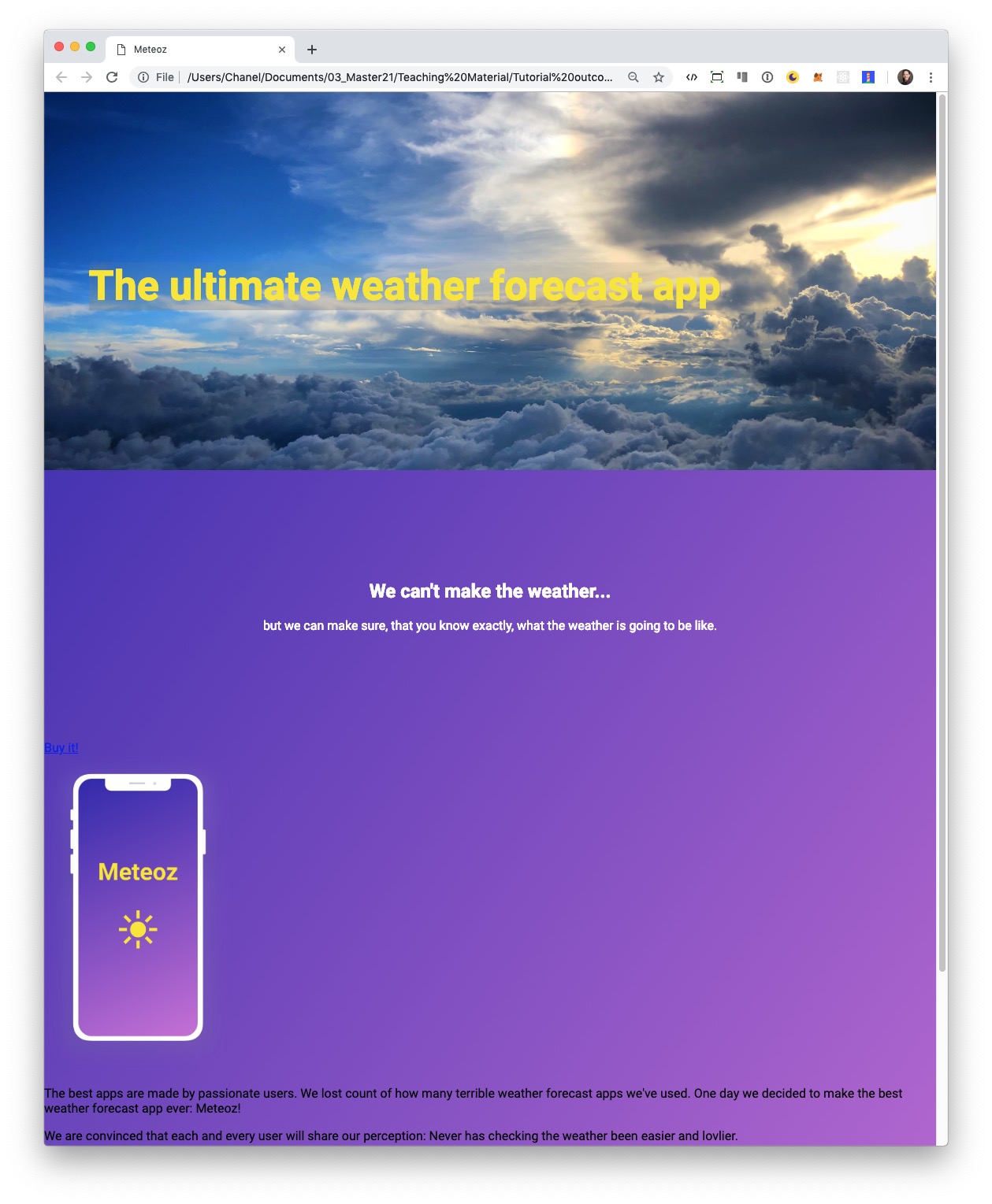
We see the changes we made to our HTML layout once we refresh the browser.
Extra
What does this bit of CSS we added do? padding: 150px 0? Head over to MDN web docs to find out.
6. Bootstrap setup and overwrite
-
Let's use Bootstrap's Grid system on our website. Link Bootstrap's stylesheet in the
headsection of your HTML before your stylesheet link. It is important to add the bootstrap stylesheet before our own stylesheet, so that we can overwrite styles afterwards.
 <!DOCTYPE html>
  <html>
    <head>
      <meta charset="utf-8">
      <title>Meteoz</title>
      <link rel="stylesheet" href="https://stackpath.bootstrapcdn.com/bootstrap/4.1.3/css/bootstrap.min.css" integrity="sha384-MCw98/SFnGE8fJT3GXwEOngsV7Zt27NXFoaoApmYm81iuXoPkFOJwJ8ERdknLPMO" crossorigin="anonymous">
      <link rel="stylesheet" href="style.css">
      <link href="https://fonts.googleapis.com/css?family=Roboto:400,400i,700" rel="stylesheet">
    </head>
  ...
-
Bootstrap comes with some handy styling. Let's add the following Bootstrap class to our link:
class="btn btn-primary btn-lg"
 ...
  <main>
    <div class="tagline-container">
      <h2>We can't make the weather...</h2>
      <p>but we can make sure, that you know exactly, what the weather is going to be like.</p>
    </div>

    <a href="#" class="btn btn-primary btn-lg">Buy it!</a>
  ...
-
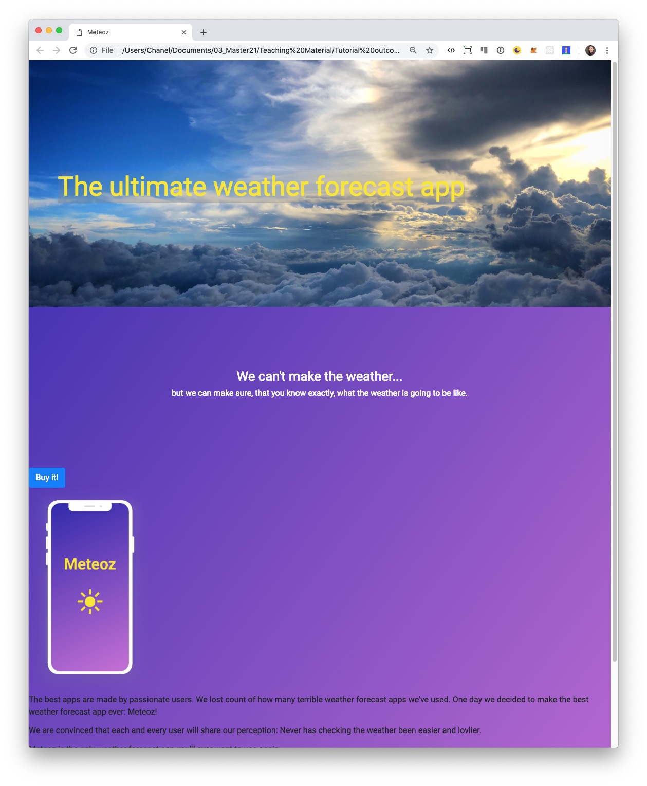
Yeah, we've got a Bootstrap button by adding the above mentioned classes to our link.
-
But we want the color of our button to be yellow. So we have to overwrite the Bootstrap style in our
style.cssat the bottom of the file.
  ...
  .btn-primary {
    background-color: #F8E71C;
    border-color: #F8E71C;
    color: black;
  }

  .btn-primary:hover {
    background-color: #e2d318;
    border-color: #e2d318;
    color: black;
  }
Refresh your browser. See how the color of the button has changed?
Extra
You can read more about Bootstrap here.7. Bootstrap Grid
-
To use Bootstrap's Grid system we'll be adding some more classes and a new div in our
mainsection.
  ...
  <main class="container">
    <div class="tagline-container">
      <h2>We can't make the weather...</h2>
      <p>but we can make sure, that you know exactly, what the weather is going to be like.</p>
    </div>

    <a href="#" class="btn btn-primary btn-lg">Buy it!</a>

    <div class="row align-items-center">

      <div class="col-md-4">
        <img src="images/iPhone.png" alt="Mockup of Meteoz app">
      </div>

      <div class="col-md-8">
        <p>
          The best apps are made by passionate users. We lost count of how many terrible weather forecast apps we've used.
          One day we decided to make the best weather forecast app ever: Meteoz!
        </p>

        <p>
          We are convinced that each and every user will share our perception:
          Never has checking the weather been easier and lovlier.
        </p>

        <p>
          Meteoz is the only weather forecast app you'll ever want to use again.
        </p>
      </div>

    </div>

  </main>

  ...
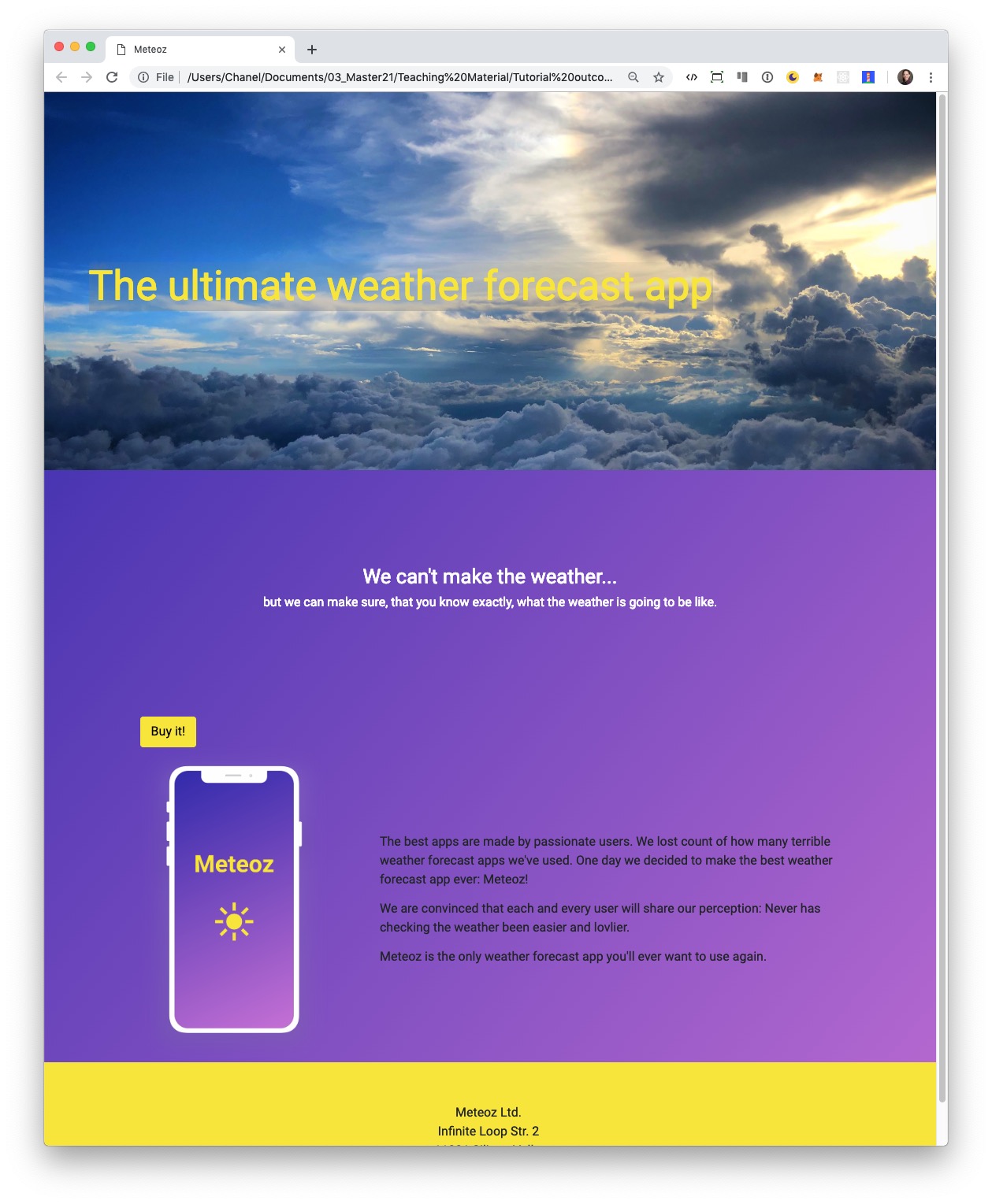
Now the iPhone mockup and the accompanying text are displayed side by side.
Extra
Learn more about Bootstrap's Grid System here.
8. Finetuning style and layout
In this step you can take your time to style the website the way you want to. Below you'll find some tips on what we would change.
-
That yellow button looks kind of lost. Let's place it in a more useful place by wrapping it with
div class="cta-container".
 ...
  <main class="container">
    <div class="tagline-container">
      <h2>We can't make the weather...</h2>
      <p>but we can make sure, that you know exactly, what the weather is going to be like.</p>
    </div>

   <div class="cta-container">
      <a href="#" class="btn btn-primary btn-lg">Buy it!</a>
   </div>
  ...
-
Then we add the following to the bottom of our
style.cssfile to change the position of thediv class="cta-container"element.
  ...
  .cta-container {
    text-align: center;
    margin: 50px 0 100px 0;
  }
-
Next we'll change the color of the font in our main section, since the contrast between black and purple isn't strong enough.
Add the following to the bottom of our
style.cssfile.
  ...
  main {
    color: white;
  }
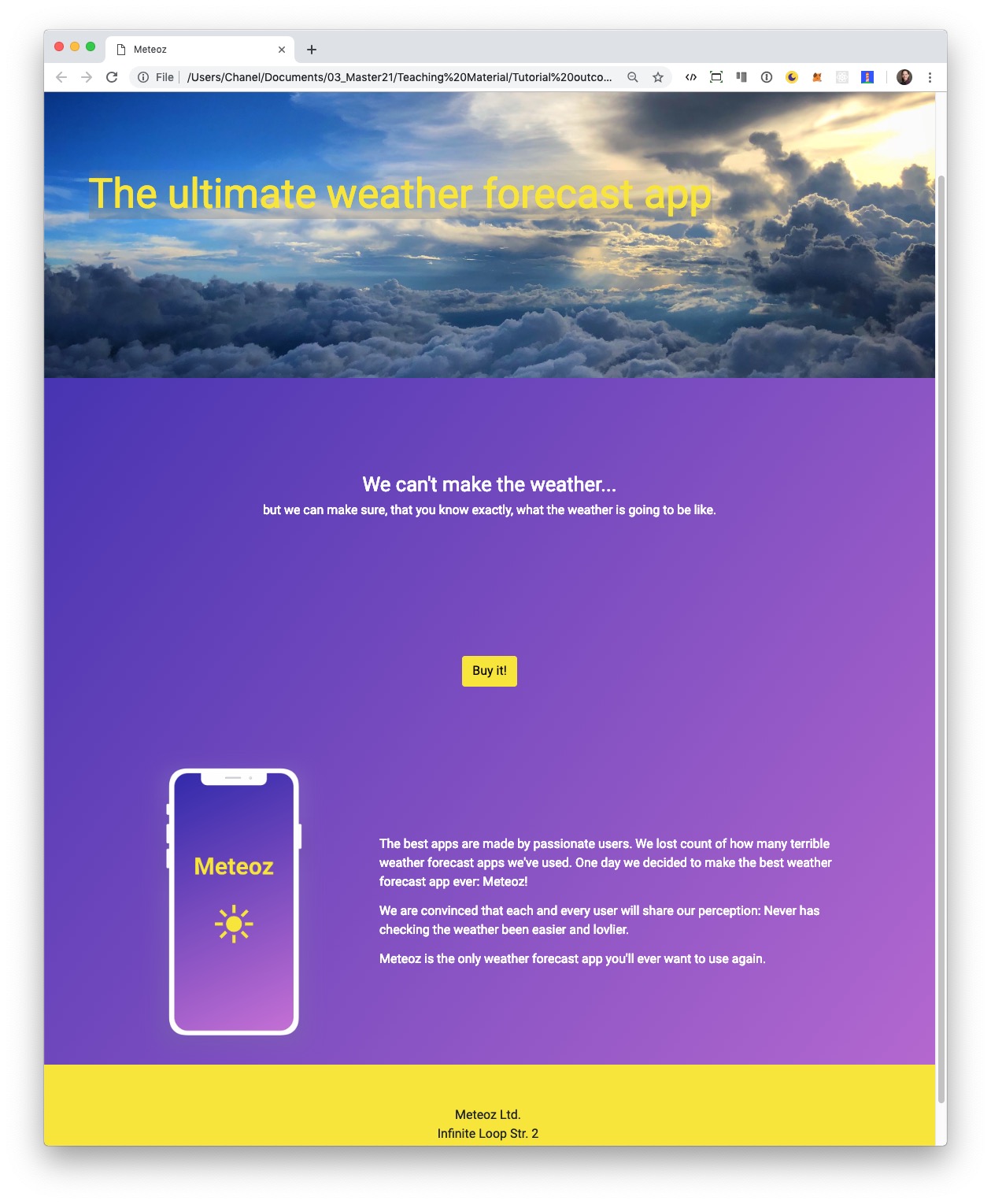
Your website should look similar to this:
Well done! You've just created your first website with HTML & CSS.